 GPTI-325
Product Marketing - Ornate Japanese Tarot Fortune Certificate
Generates a luxurious Japanese AI divination certificate with tarot cards, compass symbolism, ornate roses, and structured fortune-reading sections.
This prompt turns a rough promo layout into a finished retro Japanese music poster with upgraded vintage typography, decorative borders, and aged print styling.
Prompt
Using the provided reference image, redesign it as a polished retro Japanese music-release poster while preserving the same split layout, the same illustrated band artwork on the right, and the same overall composition. Upgrade the typography from plain placeholder text into authentic vintage poster styling: add distressed print texture, uneven ink, and a slightly worn screen-printed look. Keep the 3 vertical text columns on the left, but restyle them with stronger hierarchy and color separation: the Japanese service-announcement column in warm gold, the platform list in muted teal, and the date/release column in dusty pink. Change the bottom of the left Japanese column from the original release-start message to 「配信中♪」 and emphasize it in larger pink type with a musical note. Add thin gold decorative border lines and corner ornaments framing the left text block. On the right panel, keep the title text in the moon area but restyle it into bold distressed retro lettering that reads “MY MIDNIGHT KIDS’ COMPLEX.” Apply a cohesive nostalgic poster finish across the whole image: subtle paper grain, faded edges, light scratches, slightly darkened borders, and richer vintage teal/gold/pink color grading.
Attribution
Open the GPT Image 2 generator, paste a prompt from this library, and start iterating toward a usable image.
More like this
GPTI-325Generates a luxurious Japanese AI divination certificate with tarot cards, compass symbolism, ornate roses, and structured fortune-reading sections.
 GPTI-859
A stylized urban fashion poster showing a censored-face model in an oversized tiger graphic shirt against a distressed Japanese-inspired graffiti wall, ideal for edgy apparel branding or editorial artwork.
 GPTI-088
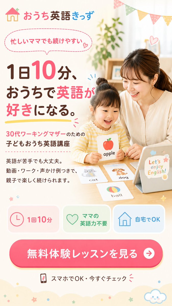
Generates a pastel Japanese landing page hero for an at-home children’s English lesson aimed at busy working mothers.
 GPTI-443
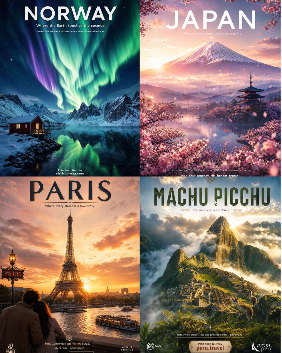
Generates a polished 2x2 set of official-style travel posters for iconic destinations, useful for tourism campaigns, thumbnails, or poster concepts.
 GPTI-444
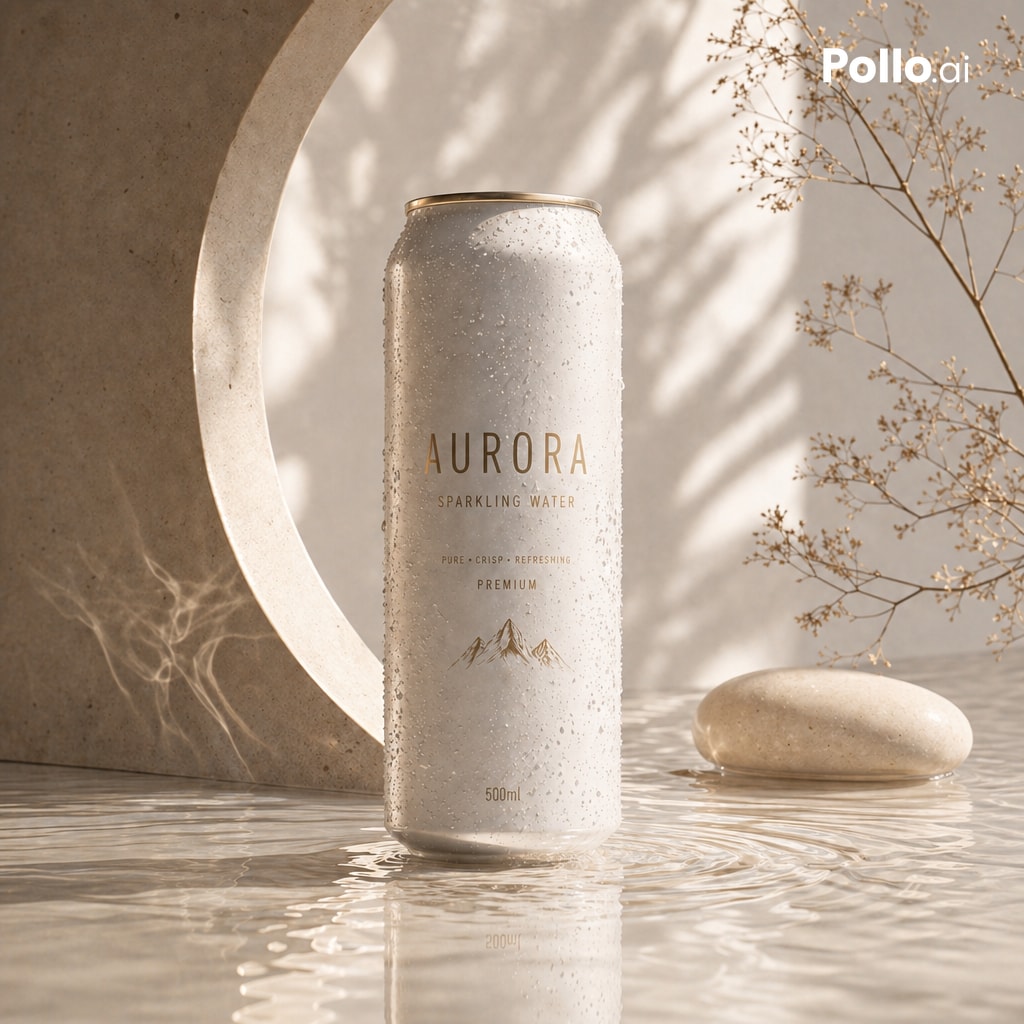
A photorealistic premium beverage product shot for creating elegant sparkling water advertisements with spa-like natural lighting.
 GPTI-554
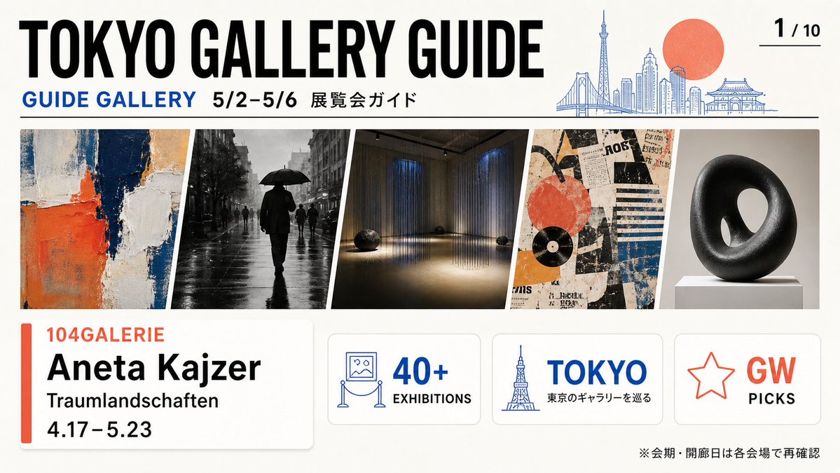
Generates a polished Tokyo gallery exhibition guide cover with image previews, event details, and informational cards for an art pamphlet or social post.